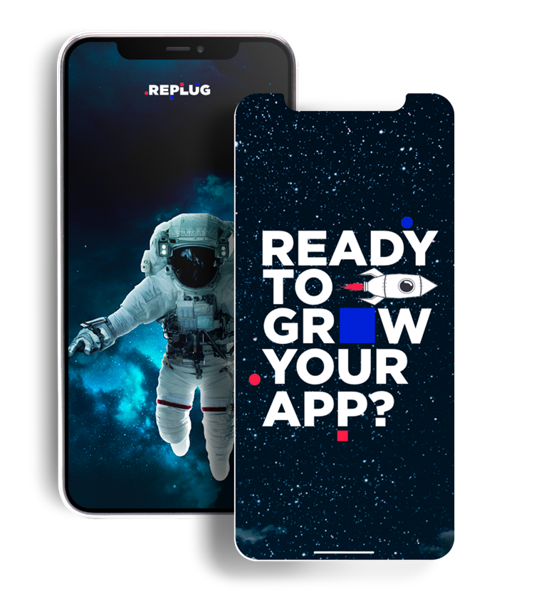
.png?width=300&name=Copy%20of%20AI%20for%20app%20marketing%20header%20(2).png)
-2.png?width=300&name=Copy%20of%20AI%20for%20app%20marketing%20header%20(1)-2.png)


.png?width=300&name=Copy%20of%20AI%20for%20app%20marketing%20header%20(1).png)


CHALLENGE

InvoiceASAP is a leading mobile invoice solution and is widely popular among field professionals in the United States. With its mobile app, it provides business professionals with an easy and fast solution to handle invoices, receipts, quotes, and accounting activities, providing seamless integration with Quickbooks Desktop (a unique feature in the market).
With the release of new app features, InvoiceASAP approached our team with the objective of increasing its organic visibility and conversion rate in the United States, while at the same time, starting paid user acquisition activities in parallel.

IMPROVE THE APP ORGANIC REACH

INCREASE THE NUMBER OF DOWNLOADS

BOOST THE CONVERSION RATE
SOLUTIONS
APP STORE FRONTS IN-DEPTH AUDIT
Our ASO team performed an in-depth audit of both Store Pages, allowing us to immediately identify opportunities to increase InvoiceASAP visibility and conversion rate, both for paid and organic traffic.
CROSS-LOCALIZATION BENEFITS
Our App Store Optimization experts took advantage of cross-localization among Stores locales to increase the number of keywords that would rank in the main Store front in the United States.
RETHINK THE VISUAL COMMUNICATION
Our designers worked on reshaping the way the screenshots would communicate the main USPs of the app, ensuring they would also follow market and category standards.
COMMUNICATION STRATEGY
Our designers reviewed the initial style of the screenshots and adopted a fresher look that would focus on the main USPs making them clearer, as well as appealing to different professional categories.
.jpg)
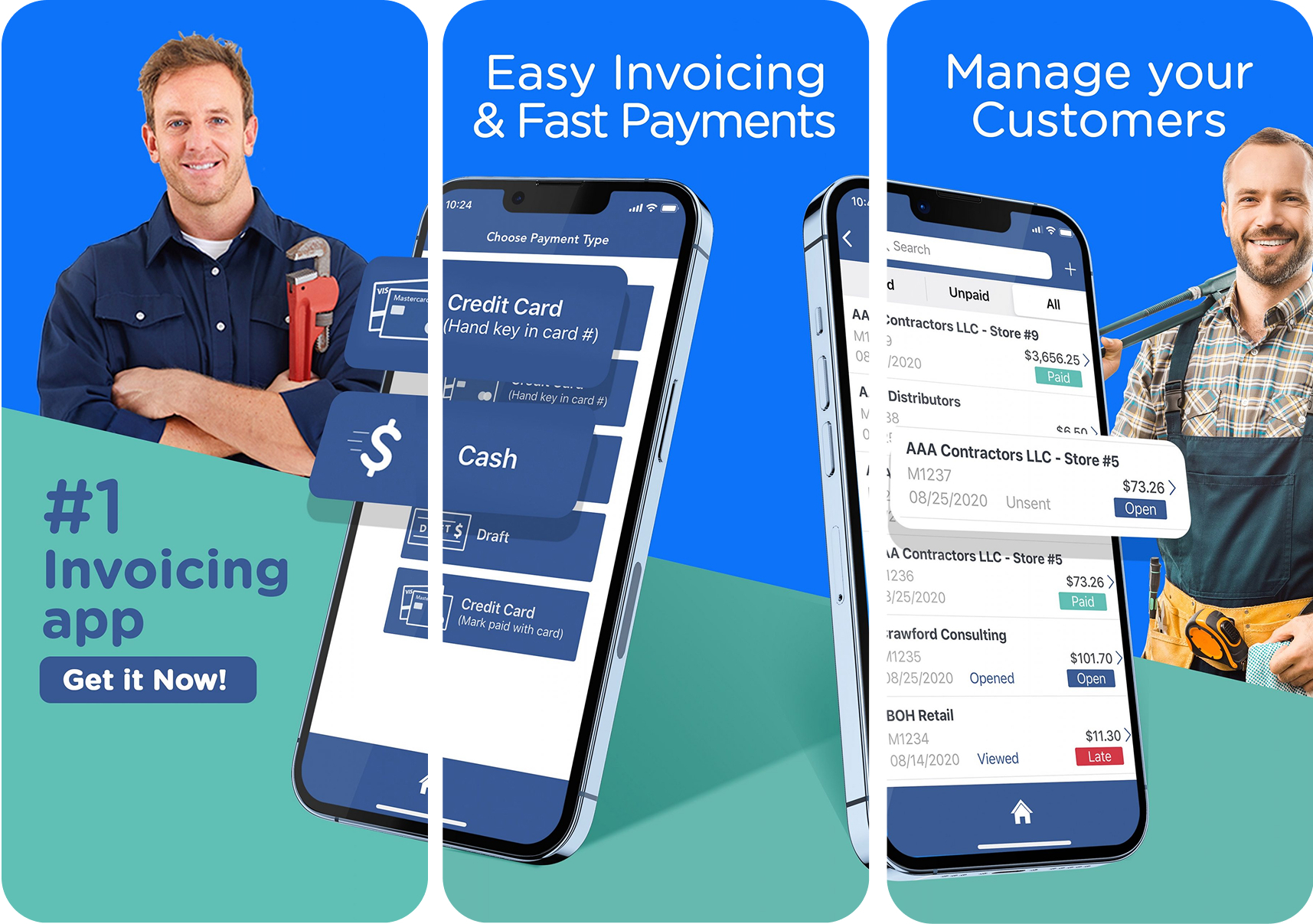
IMPACTFUL CHANGES
DESIGN CONTINUITY
The new design focused on creating continuity between the screenshots, helping users discover more of the app’s USPs and benefits for its use.
VALUE-FOCUSED DESIGN
Our designers and ASO managers decided to highlight the in-app features that were the most interesting, while portraying different professionals that could benefit from the app.
CLEARER CALL-TO-ACTIONS
Together with the rest of elements, the team wanted to ensure that potential users would see immediately the main app features with stronger, clearer and bolder CTAs per screenshot.
GET IN TOUCH
DO YOU WANT TO IMPROVE YOUR ORGANIC VISIBILITY?
REACH OUT TO US!